In every simple and complex logo design, each has its meanings and symbolism presented. From the type of colour, design and font are carefully chosen to reflect the brand of a company. Among all the logos that you have seen every single day, have you ever thought about the reason why the logos are designed in that manner? Here are 28 famous brand logos that you may not have realised that they actually have a hidden meaning behind it.
![]()
Nike
Nike’s simple logo is designed to convey speed and motion. It is also the wing of Nike, the Greek goddess of victory. The logo was designed by Carolyn Davidson, a student designer who was only paid $35 to create it.
![]()
Chanel
The double “C” logo is more than just the initials of Coco Chanel. She was inspired by the vaulted arches and the stained glass windows of the Château de Cremat, a castle where she often attended events.

Dell
Founder Michael Dell kick-started his business with the purpose to “turn the world on its ear,” an ambition represented by the slanted “E.
Uniqlo
The use of katakana(a Japanese syllabary) evokes an Asian red-ink seal, subliminally describing a level of craftsmanship that is worth including their name.
Formula 1(old logo)
The negative space between the black F and the red racing stripes creates the number 1.
.png)
Versace
Versace’s logo is a portrait of Medusa. Gianni Versace chose the portrait because he wanted his fashion to be so visually stunning that it captures everyone’s heart forever.
![]()
Chevrolet
Co-founder William C.Durant claims he was inspired by a Parisian hotel wallpaper pattern he saw in 1908. However, his daughter said he drew it on a napkin during dinner, while his said the Coalettes logo he saw in a newspaper bought the idea.
![]()
Domino’s
The three dots signifies the three original Domino’s location. The initial plan was to include a dot for every new location. The plan did not come to fruition after the franchise had expanded beyond the expectations of the owner.
![]()
Hershey’s Kisses
There’s a sideways silhouette of a Hershey’s Kiss between the “K” and the “I.”
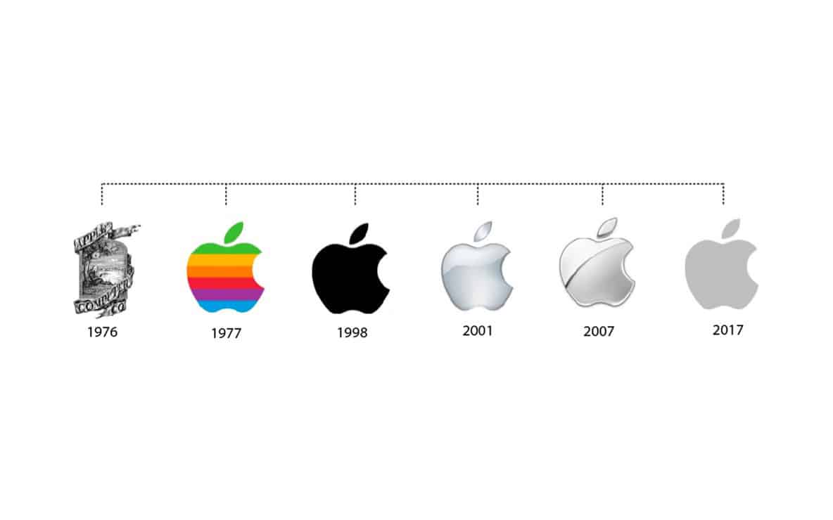
Apple
Designer Rob Janoff spent his time drawing apples for inspiration. He took a bite out of an apple as an experiment, then realised that “bite” sounds similar to the computer term “byte.”
![]()
BMW
BMW was initially known for manufacturing aircraft engines, which led people to believe that the checkered logo means a white propeller and a blue sky behind it. In fact, the logo symbolizes the flags of Bavaria.
![]()
Gillette
The “G” and the “I” have been perfectly cut across to signify the precision and sharpness o their razors.
![]()
LG
LG’s logo contains a winking face and the letters “L” and “G.” The “L” is the nose, and the “G” is the face shape.

![]()
Coca-Cola
Coca-Cola discovered that the Denmark flag is “hidden” in their logo. They embraced this wholesome coincidence by putting together an interactive advertisement at the Copenhagen Airport that handed out flags.
![]()
Toblerone
The coat of arms of Bern(where Toblerone is made) contains a bear; there’s a hidden bear in the mountain.
![]()
Beats
The “b” is actually headphones, and the red circle is a head.
McDonald’s
The “M’ of the Golden Arches represents the first letter of “McDonald’s,” but there’s also a more subtle meaning. Psychologist and design consultant Louis Cheskin intended for the rounded “M” to present nourishing breasts.
Toyota
The three overlapping ellipses symbolize the unification of the hearts of customers and the heart of Toyota products. Another interesting act is that all of the letters of “Toyota” are presented in the logo.
![]()
The Google logo uses the primary colors of blue, red, and yellow except for the letter “L” which is green. Ruth Kedar, the logo designer, describes how this is meant to symbolize how Google challenges the rules.
![]()
Starbucks
The siren was subtly asymmetrically designed to make her appear more welcoming, worldly and human.
![]()
Pepsi
The redesign of the Pepsi logo in 2009 cost $1 million. A schematic design indicates that the logo was inspired by the Parthenon, the Mona Lisa, the Hindu numerical harmony, the earth’s gravitational field and the speed of light.
![]()
Amazon
The arrow links “A” to “Z” because Amazon has everything to sell from A to Z.
![]()
Baskin Robbins
Number 31 stands for their belief that guests should have the chance to explore a fun, new flavor of ice cream every day of the month.
FedEx
There is an arrow between the “E” and “X” of “Ex” that symbolizes speed.
What other famous brand logos that has their own hidden meaning? Leave us your thoughts on the comment sections below. Head over to Jobstore.com and unveil your next job opportunity.